
How to Read a Stock Quote and Stock Chart: A Complete Beginner’s Guide

You’ve placed your first trade. The order went through, the stock is sitting in your Demat account, and now you’re staring at your broker’s app trying to make sense of a wall of numbers — LTP, OHLC, volume, 52-week high, a green and red candle-looking chart — and none of it means anything yet.
This is exactly where every investor gets stuck once, including people who’ve been in the market for years and never actually sat down to learn what these numbers mean. If you’ve followed this series from understanding what the stock market is through opening your Demat account and placing your first trade, this post fills in the piece that ties everything together: how to actually read what you’re looking at.
What Is a Stock Quote? Understanding LTP and the Basics
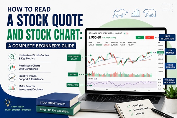
A stock quote is simply a snapshot of a stock’s trading information at a given moment. When you search for a stock on your broker’s app or on the NSE/BSE website, here’s what you’re typically looking at:
LTP (Last Traded Price) — the price at which the most recent trade for that stock actually happened. This is the number most people mean when they casually ask “what’s the price of the stock right now?” It’s not a fixed price — it updates continuously as new trades happen throughout the day.
Bid Price and Ask Price — the bid is the highest price a buyer is currently willing to pay, and the ask (or offer) is the lowest price a seller is currently willing to accept. The gap between the two is called the bid-ask spread. A small spread usually means the stock is actively traded (highly liquid); a wide spread can mean fewer people are trading it, which makes it harder to buy or sell at the price you want.
Day’s Range — the lowest and highest price the stock has touched during the current trading session.
What Does OHLC Mean in the Stock Market?
You’ll see OHLC referenced constantly once you start reading charts, and it’s simpler than it looks:
- Open — the price at which the stock started trading when the market opened that day
- High — the highest price reached during the day
- Low — the lowest price reached during the day
- Close — the final traded price when the market closed
Every single candle on a stock chart, no matter what time frame you’re looking at, is built from these four numbers. Understanding OHLC is the foundation for reading everything else on a chart.
To get the regular updates follow us on Youtube and Instagram
Understanding 52-Week High and 52-Week Low
This tells you the highest and lowest price a stock has traded at over the past year. It’s a quick way to gauge where the current price sits relative to its recent history — a stock trading near its 52-week high suggests strong recent momentum, while one near its 52-week low might be out of favor, undervalued, or facing genuine business trouble. The number alone doesn’t tell you which of these is true; it’s a starting point for research, not a verdict.
Why Volume Matters More Than Beginners Realize
Volume is the number of shares traded during a given period. It matters because price movement backed by high volume is generally considered more meaningful than the same movement on low volume. A stock jumping 5% on unusually high volume suggests real buying interest; the same jump on thin volume could just be a handful of trades moving a less-active stock. As a beginner, you don’t need to master volume analysis right away — just get in the habit of glancing at it alongside the price.
How to Read a Candlestick Chart for Beginners
Most broker apps default to a candlestick chart, and it’s worth learning to read at a glance rather than avoiding it.
Each candle represents one time period (a day, an hour, five minutes — whatever you’ve selected) and shows the OHLC data visually:
- The thick middle part is called the body, showing the range between the open and close.
- A green (or sometimes white/hollow) candle means the close was higher than the open — the price went up during that period.
- A red (or filled) candle means the close was lower than the open — the price went down.
- The thin lines above and below the body are called wicks or shadows, showing the highest and lowest price reached, even if the price didn’t close there.
You don’t need to memorize candlestick patterns to get started. Just being able to glance at a chart and understand “green means up, red means down, and the wick shows how far it swung” already puts you ahead of where most first-time investors are.
Support, Resistance, and Moving Averages: The Next Layer
Once basic quote and candle reading feels comfortable, you’ll start seeing two more terms come up often:
Support is a price level where a stock has historically tended to stop falling and bounce back up, because enough buyers step in at that price. Resistance is the opposite — a level where the stock has tended to stop rising, because enough sellers show up to cap it.
A moving average (commonly the 50-day or 200-day) smooths out daily price noise into a single line, making the overall trend easier to see. When a stock’s price is above its moving average, it’s often read as a sign of an uptrend; below it, a downtrend. These are tools for spotting patterns, not guarantees of what happens next.
A Simple Way to Read Any Stock Chart, Step by Step
- Check the LTP and compare it to yesterday’s close — is the stock up or down today, and by how much?
- Glance at OHLC for the day to see the actual range it moved in.
- Look at where the price sits relative to its 52-week high and low.
- Check the volume — is today’s activity higher or lower than usual for this stock?
- Look at the overall shape of the chart over the last few weeks or months — is it trending up, down, or moving sideways?
- Only after this basic scan should you move on to deeper research like the company’s fundamentals, which we’ll cover in the next post in this series.
Common Mistakes Beginners Make When Reading Charts
- Reacting to LTP alone without checking the broader trend or volume behind the move.
- Assuming a 52-week low always means “cheap” and a bargain — sometimes a stock is low for a real, ongoing reason.
- Switching timeframes constantly (1-minute, then daily, then monthly) and getting confused because each tells a different story.
- Treating candlestick patterns as guarantees rather than probabilities based on historical tendency.
About This Guide
This post continues FinanceChecks.com‘s beginner series on investing in the Indian stock market, building on our earlier posts covering what the stock market is, why to invest in stock market, Stock Market essential terminology, Demat vs trading accounts, how to open your account, and how to place your first trade. The concepts explained here — OHLC, LTP, volume, candlesticks, support/resistance, and moving averages — are standard terminology used across NSE, BSE, and all major Indian broking platforms as of 2026.
Last updated: [insert date]
Frequently Asked Questions
1. What does LTP mean in stock market terms? LTP stands for Last Traded Price — the price at which the most recent actual trade for that stock took place. It updates continuously during market hours as new trades occur.
2. Why does the same stock show a different price on NSE and BSE? Because NSE and BSE are separate exchanges with their own independent order books. Prices are usually very close but can differ by small amounts due to differences in trading activity on each exchange; arbitrage trading tends to keep the gap narrow.
3. What is considered good volume for a stock? There’s no single “good” number — it depends on the stock’s own typical trading activity. What matters more is comparing today’s volume to that stock’s recent average; a sharp spike above average often signals unusual interest.
4. What does it mean when a stock hits its 52-week high or 52-week low? It means the stock is trading at the highest (or lowest) price it has reached in the past twelve months. It’s a reference point for recent price history, not a signal to automatically buy or sell.
5. Is a high P/E ratio good or bad? Neither by itself. A high P/E can mean investors expect strong future growth, or it can mean the stock is overpriced relative to its earnings. It’s most useful when compared against similar companies in the same industry, not looked at in isolation.
6. How often does a stock chart update? During market hours, real-time or near-real-time charts update continuously as new trades happen. Daily charts finalize their candle once the trading session closes for the day.
7. Do I need to understand candlestick patterns before I start investing? No. Understanding basic OHLC, LTP, and volume is enough to get started. Candlestick pattern reading is a deeper skill you can build over time as you get more comfortable with the basics.
Disclaimer
This article is for educational purposes only and does not constitute investment advice, a recommendation to buy or sell any security, or a solicitation of any kind. Stock market investments are subject to market risks, and prices can be volatile. Past price behavior, chart patterns, and historical trends do not guarantee future performance. Terminology, data displays, and chart tools may vary slightly across brokers and platforms — always verify details on your own broker’s app or the official NSE/BSE websites. Readers are strongly encouraged to do their own research or consult a SEBI-registered investment advisor before making any investment decisions. FinanceChecks.com and its authors accept no liability for losses arising from the use of this information.

Shuchi founded Finance Checks after spending 16+ years working in corporate, managing operations and distribution. She managed her own finances, learned and read regularly and helped people make sense of their savings, loans, insurance, and investments.
She started this site to offer the kind of clear, honest financial guidance she wished was more available when she was learning to manage her own money. Every article is researched personally, checked against official sources such as the Reserve Bank of India, SEBI, or the Income Tax Department, and revisited whenever regulations or figures change. She is upfront about how the site earns money through ads and select affiliate partnerships, and she does not let either influence what she actually recommends to readers.



-
-
-
-
-
-
Show Comments[…] How to Read a Stock Quote and Stock Chart: A Complete Beginner’s Guide […]
[…] how market indices like Sensex and Nifty move and how to actually read what’s happening on a stock chart — both of which we’ll cover in the next posts in this […]
[…] How to Read a Stock Quote and Stock Chart: A Complete Beginner’s Guide […]
[…] How to Read a Stock Quote and Stock Chart: A Complete Beginner’s Guide […]
[…] How to Read a Stock Quote and Stock Chart: A Complete Beginner’s Guide […]
[…] market is through fundamental analysis, this is a natural next step, since you already have the chart-reading foundation from our post on reading stock quotes and […]